Introduction
Every week on Flutter forums and Discord servers, junior developers ask the same question: "Which responsive package should I use? flutter_screenutil? responsive_framework? sizer?"
Here is the honest answer from production experience: you do not need any of them.
Third-party responsive packages add dependency weight, lock you into their API, and often conflict with your existing layout code when you try to update Flutter. More importantly, they solve a problem that MediaQuery already solves cleanly - you just need to centralize it properly.
In every production Flutter app I build, I use a custom ResponsiveConfig system built entirely on top of MediaQuery. It gives me:
- A single initialization point for all screen dimensions
- Reference-based proportional scaling for both mobile and tablet
- Clean extensions:
20.w,14.sp,10.h- readable anywhere in the codebase - Automatic tablet detection with a custom breakpoint
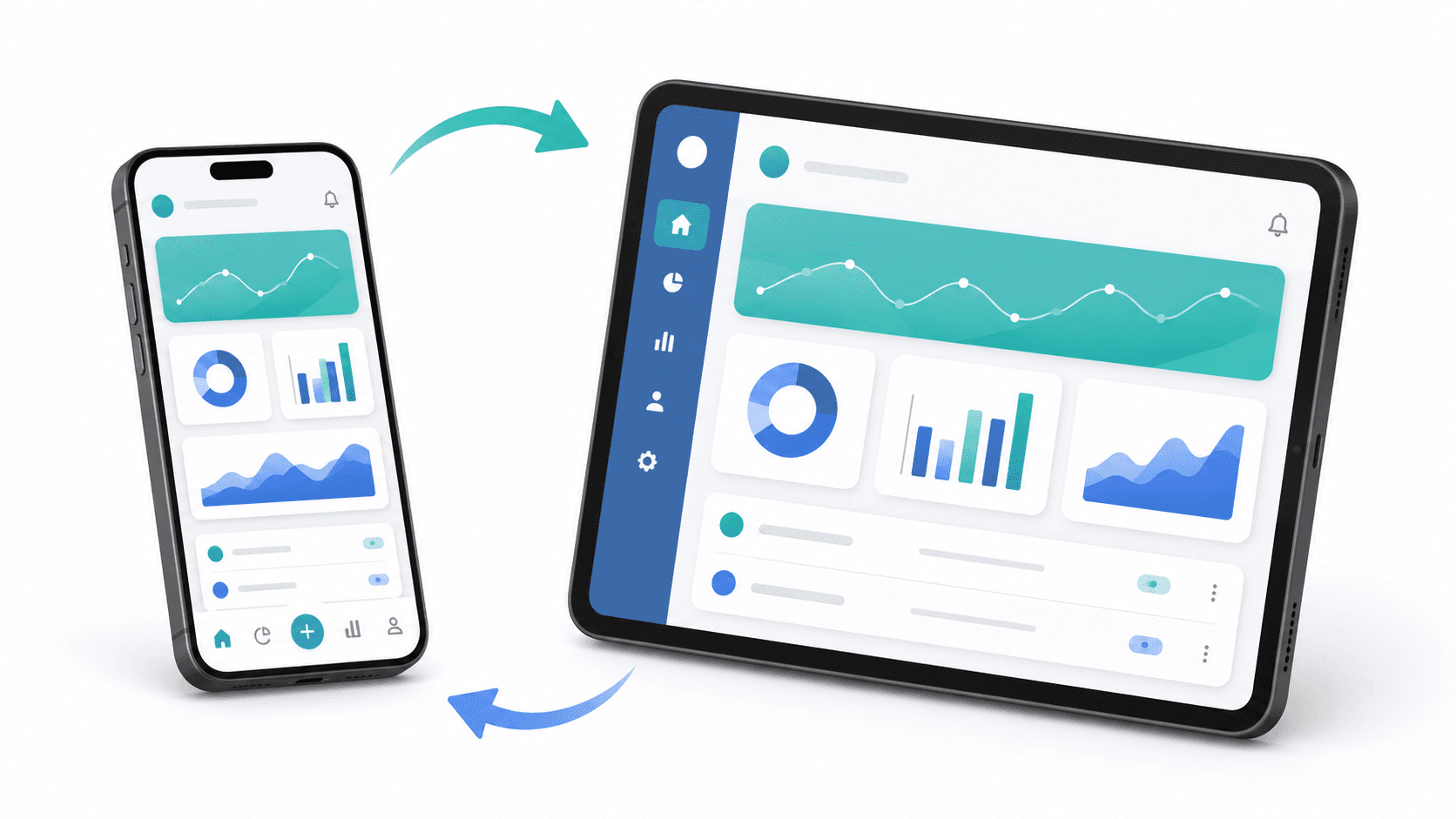
- Effortless switching between bottom navigation (mobile) and sidebar navigation (tablet)
The full implementation is part of my open-source Flutter Clean Architecture Template available on GitHub.
This blog explains the system end-to-end - the design thinking, the code, and how to use it in practice.
Why Third-Party Packages Fall Short
Before building the solution, it helps to understand the real problem.
The wrong approach - MediaQuery scattered everywhere:
// This pattern is a maintenance nightmare
class ProductCard extends StatelessWidget {
  @override
  Widget build(BuildContext context) {
    final width = MediaQuery.of(context).size.width;
    final height = MediaQuery.of(context).size.height;

    return Container(
      width: width * 0.45,
      height: height * 0.2,
      padding: EdgeInsets.all(width * 0.04),
      child: Text(
        'Product Name',
        style: TextStyle(fontSize: width * 0.04),
      ),
    );
  }
}
Problems with this:
MediaQuery.of(context)rebuilds the entire widget on every screen rotation- Magic multipliers (
0.45,0.04) have no semantic meaning - No tablet-specific logic - a
width * 0.45card on a 12" iPad looks terrible - Changes to design sizing require hunting down every raw
MediaQuerycall
The right approach: centralized, initialized once, accessed via extensions.
The ResponsiveConfig System
The system has three parts:
ResponsiveConfig- Static class initialized once per build, holds all screen data and scaling logicResponsiveProvider- Flutter widget that initializesResponsiveConfigat the top of the widget tree- Responsive extensions -
.w,.h,.sponnumfor clean in-widget usage
Part 1: ResponsiveConfig
// lib/core/config/responsive_config.dart
import 'package:flutter/material.dart';

class ResponsiveConfig {
  // Current device dimensions - set at init time
  static late double screenWidth;
  static late double screenHeight;
  static late Orientation orientation;
  static late bool isTablet;

  // Reference design sizes (match your Figma/design files)
  // These are the dimensions your designer used to create mockups
  static late double mobileReferenceWidth;
  static late double mobileReferenceHeight;
  static late double tabletReferenceWidth;
  static late double tabletReferenceHeight;

  static bool _initialized = false;

  /// Initialize once at the root of the widget tree via ResponsiveProvider.
  /// Never call this from individual widgets.
  static void initialize({
    required BuildContext context,
    double mobileRefWidth = 390.0,   // iPhone 14 Pro width
    double mobileRefHeight = 844.0,  // iPhone 14 Pro height
    double tabletRefWidth = 820.0,   // iPad Air width
    double tabletRefHeight = 1180.0, // iPad Air height
    double tabletBreakpoint = 600.0, // Width above which device is tablet
  }) {
    final mediaQuery = MediaQuery.of(context);
    final size = mediaQuery.size;

    screenWidth = size.width;
    screenHeight = size.height;
    orientation = mediaQuery.orientation;
    isTablet = size.shortestSide >= tabletBreakpoint;

    mobileReferenceWidth = mobileRefWidth;
    mobileReferenceHeight = mobileRefHeight;
    tabletReferenceWidth = tabletRefWidth;
    tabletReferenceHeight = tabletRefHeight;

    _initialized = true;
  }

  /// Scale a width dimension proportionally to screen width.
  /// Based on the design's reference width for the current device class.
  static double scaleWidth(double designWidth) {
    assert(_initialized, 'ResponsiveConfig.initialize() must be called first');
    final refWidth = isTablet ? tabletReferenceWidth : mobileReferenceWidth;
    return designWidth * (screenWidth / refWidth);
  }

  /// Scale a height dimension proportionally to screen height.
  static double scaleHeight(double designHeight) {
    assert(_initialized, 'ResponsiveConfig.initialize() must be called first');
    final refHeight = isTablet ? tabletReferenceHeight : mobileReferenceHeight;
    return designHeight * (screenHeight / refHeight);
  }

  /// Scale a font size.
  /// Uses the average of width and height scaling for better readability.
  static double scaleFontSize(double designFontSize) {
    assert(_initialized, 'ResponsiveConfig.initialize() must be called first');
    final refWidth = isTablet ? tabletReferenceWidth : mobileReferenceWidth;
    final refHeight = isTablet ? tabletReferenceHeight : mobileReferenceHeight;
    final widthScale = screenWidth / refWidth;
    final heightScale = screenHeight / refHeight;
    // Average of both scales gives better font rendering across all screen sizes
    return designFontSize * ((widthScale + heightScale) / 2);
  }
}
Part 2: ResponsiveProvider
This widget initializes ResponsiveConfig exactly once when the app launches and again on every orientation change:
// lib/core/config/responsive_provider.dart
import 'package:flutter/material.dart';
import 'responsive_config.dart';

class ResponsiveProvider extends StatelessWidget {
  final Widget child;

  const ResponsiveProvider({super.key, required this.child});

  @override
  Widget build(BuildContext context) {
    // Called on every build - handles orientation changes automatically
    ResponsiveConfig.initialize(context: context);
    return child;
  }
}
Wrap your MaterialApp with it:
// lib/app/my_app.dart
class MyApp extends StatelessWidget {
  @override
  Widget build(BuildContext context) {
    return MaterialApp(
      home: ResponsiveProvider(
        child: const HomeScreen(),
      ),
      // Or wrap the builder for global coverage:
      builder: (context, child) => ResponsiveProvider(child: child!),
    );
  }
}
Part 3: Responsive Extensions
The extensions are what make this system feel natural to use. Instead of calling ResponsiveConfig.scaleWidth(20), you write 20.w:
// lib/core/extensions/responsive_extension.dart
import '../config/responsive_config.dart';

extension ResponsiveExtension on num {
  /// Scale as a width dimension
  /// Usage: 20.w (scales 20 dp proportionally to screen width)
  double get w => ResponsiveConfig.scaleWidth(toDouble());

  /// Scale as a height dimension
  /// Usage: 10.h (scales 10 dp proportionally to screen height)
  double get h => ResponsiveConfig.scaleHeight(toDouble());

  /// Scale as a font size
  /// Usage: 14.sp (scales 14 font size proportionally)
  double get sp => ResponsiveConfig.scaleFontSize(toDouble());

  /// Alias for width scaling - useful for padding/margin values
  double get dp => w;
}
Using the System in Widgets
With the system in place, here is how your widgets look:
// WITHOUT ResponsiveConfig - fragile, hardcoded
class ProductCard extends StatelessWidget {
  @override
  Widget build(BuildContext context) {
    return Container(
      width: 180,
      height: 220,
      padding: const EdgeInsets.all(16),
      child: Text(
        'Product Name',
        style: const TextStyle(fontSize: 16, fontWeight: FontWeight.w600),
      ),
    );
  }
}

// WITH ResponsiveConfig - scales perfectly on every device
class ProductCard extends StatelessWidget {
  @override
  Widget build(BuildContext context) {
    return Container(
      width: 180.w,    // Scales proportionally to screen width
      height: 220.h,   // Scales proportionally to screen height
      padding: EdgeInsets.all(16.w),
      child: Text(
        'Product Name',
        style: TextStyle(
          fontSize: 16.sp,              // Font scales correctly
          fontWeight: FontWeight.w600,
        ),
      ),
    );
  }
}
On an iPhone SE (375pt wide), 180.w scales down slightly. On an iPad (820pt wide), it scales up proportionally. The UI always looks like it was designed for that exact screen.
Adaptive Navigation: Mobile vs Tablet
The most impactful use of ResponsiveConfig.isTablet is navigation layout. Mobile apps use BottomNavigationBar. Tablet apps use NavigationRail or a side drawer.
// lib/app/shell/app_shell.dart
class AppShell extends StatefulWidget {
  const AppShell({super.key});

  @override
  State<AppShell> createState() => _AppShellState();
}

class _AppShellState extends State<AppShell> {
  int _selectedIndex = 0;

  static const _pages = [
    HomeTab(),
    SearchTab(),
    ProfileTab(),
    SettingsTab(),
  ];

  static const _destinations = [
    NavigationDestination(icon: Icon(Icons.home_outlined), label: 'Home'),
    NavigationDestination(icon: Icon(Icons.search), label: 'Search'),
    NavigationDestination(icon: Icon(Icons.person_outline), label: 'Profile'),
    NavigationDestination(icon: Icon(Icons.settings_outlined), label: 'Settings'),
  ];

  @override
  Widget build(BuildContext context) {
    // ResponsiveConfig.isTablet is already initialized by ResponsiveProvider
    if (ResponsiveConfig.isTablet) {
      return _buildTabletLayout();
    }
    return _buildMobileLayout();
  }

  Widget _buildMobileLayout() {
    return Scaffold(
      body: _pages[_selectedIndex],
      bottomNavigationBar: NavigationBar(
        selectedIndex: _selectedIndex,
        onDestinationSelected: (index) => setState(() => _selectedIndex = index),
        destinations: _destinations,
      ),
    );
  }

  Widget _buildTabletLayout() {
    return Scaffold(
      body: Row(
        children: [
          NavigationRail(
            extended: ResponsiveConfig.screenWidth > 900, // Full labels on wide tablets
            selectedIndex: _selectedIndex,
            onDestinationSelected: (index) => setState(() => _selectedIndex = index),
            destinations: _destinations
                .map((d) => NavigationRailDestination(icon: d.icon, label: Text(d.label)))
                .toList(),
          ),
          const VerticalDivider(width: 1),
          Expanded(child: _pages[_selectedIndex]),
        ],
      ),
    );
  }
}
This pattern gives you:
- Mobile: full-width content + bottom navigation bar
- Tablet (narrow): sidebar with icons only + full-width content
- Tablet (wide): expanded sidebar with icons and labels + full-width content
Reference Size Guidelines
Your reference sizes should match the device your designer used for mockups. Common choices:
| Device | Width | Height |
|---|---|---|
| iPhone SE (small) | 375 | 667 |
| iPhone 14 Pro (standard) | 390 | 844 |
| iPhone 14 Plus (large) | 428 | 926 |
| iPad Air (tablet) | 820 | 1180 |
| iPad Pro 12.9" (large tablet) | 1024 | 1366 |
Set mobileRefWidth and mobileRefHeight in ResponsiveConfig.initialize() to match your Figma frame size.
Comparing to flutter_screenutil
| Feature | flutter_screenutil | Custom ResponsiveConfig |
|---|---|---|
| External dependency | Yes | No |
| Tablet support | Limited | Full, custom breakpoint |
| API | .w, .h, .sp, .r | .w, .h, .sp |
| Initialization | ScreenUtil.init() | ResponsiveConfig.initialize() |
| Navigation adaptation | No | Built-in isTablet flag |
| Customizable scaling | Limited | Full control |
| Package updates needed | Yes | No |
The custom system gives you full control, no external dependencies, and cleaner tablet support with no real tradeoffs.
Conclusion
Responsiveness is not a feature you add at the end of development. It is architecture. When you scatter MediaQuery.of(context).size.width * 0.45 across dozens of widgets, you create a maintenance debt that compounds with every new screen size that hits the market.
The ResponsiveConfig system solves this cleanly:
- Initialize once, access everywhere
- Extensions that read like design specs:
20.w,14.sp,10.h - A single
isTabletboolean that drives your entire navigation architecture - Zero external dependencies
If you are building Flutter apps for real users across real devices - phones, tablets, foldables - adopt this pattern from day one. Your future self, and every junior developer who joins your team, will thank you.
The full implementation is part of my Flutter Clean Architecture Template on GitHub - production-ready, fully documented, and free to use.
Need to optimize your app for tablets, foldables, or web? I build pixel-perfect, adaptive, and package-free responsive layouts in Flutter that scale seamlessly across all screen sizes. Book a meeting to discuss responsive UI optimization.
Written by Moeen Ahmad, Senior Software Engineer working across mobile apps, backend systems, cloud deployments, and AI-powered products. I write about practical engineering, real project lessons, and building software that actually ships.
Interested in working together?
Let's discuss your project and explore how I can help bring it to life.